Starting in March 2020, the COVID-19 pandemic resulted in a catastrophic drop in ridership - and correspondingly in revenue - for the MBTA. Even as trips began to return on the system during the summer of 2020, the MBTA continued to contend with low levels of ridership and associated budget shortfalls. During the fall of 2020, without knowledge of whether federal funding would be made available, the agency had to plan for the worst case scenario and develop a system for guiding potential service cuts. As part of this process, OPMI helped to develop a new metric framework to ensure that service decisions would be centered around ridership and equity at a time when riders who remained on the system comprised a truly transit-critical population. While the pandemic provided an immediate need for such a metric, it was designed as a tool that could be applied to future service decisions as well. The framework incorporated two measures:
- Ridership propensity: includes measures of pre-COVID ridership levels along with ridership retention during COVID
- Transit criticality: considers where low-income people, people of color, and people from low-vehicle households are making trips
Services that had high ridership and that served high transit-critical populations were flagged as essential, with the goal of continuing to provide levels of service at Service Delivery Policy levels, while services that fell into the other three quadrants - particularly those with both low ridership propensity and low transit criticality scores - were considered for service reductions.

While ridership is a direct measure of use of MBTA services, transit criticality was a new metric that focused on access to the system for trips that were most important to serve (whether or not they happened on the MBTA). While access is traditionally measured in terms of residential data, we believed it was important to account for where (and which) people were traveling during the pandemic, not where they lived. We relied on location-based data from StreetLight Data services to develop this methodology. In this post we’ll take a deep dive into the transit criticality metric and illustrate how it differs from traditional approaches.
Traditional Methodology
There are two dominant methods for evaluating the equity of a public transportation route. The closest approximation to reality is typically achieved through passenger surveys like the 2015-17 MBTA Systemwide Passenger Survey. However, major shifts in travel patterns and ridership demographics during the COVID-19 pandemic meant that rider census data was outdated, and pandemic restrictions made it impossible to conduct a new survey.
The other common approach is to associate transportation routes with residential demographic data from the areas around route stops. We explored the problems with this strategy in a 2018 Data Blog post called Does U.S. Census Data Predict MBTA Ridership, which demonstrated that even in normal times a residential metric underestimates the proportion of minority bus riders. However, we still wanted to test what a resident-based version of the transit criticality metric would look like, so we recreated it using American Community Survey 5-Year Data (2014-19) from the U.S. Census Bureau.
We started by making half-mile buffers – the typical distance used to represent a 10-minute walkshed – around all transit stops. U.S. census data is aggregated at the scale of block groups and census tracts, and any geography that intersected a buffer was joined to that stop. This allowed us to create a table associating census geographies with their nearby stops. We joined the census data to the geographies, aggregated the demographic information by stop, and then aggregated to the route level.
Next, we calculated the percent of individuals associated with each route who were low-income, people of color, or people from low-vehicle households. The percent for each category was added together for a complete “transit criticality” score. This means that a route could theoretically score up to 300% if the entire population associated with the route fell into all three transit criticality categories.
There is often a relationship between the people who live near a transportation service and those who use it, but a resident-based metric makes the flawed assumption that most travel begins or ends at home. In fact, studies have shown that commuting - the most significant category of home-based trips - only accounts for 15-20% of all travel, which means that the majority of trips are not accounted for with a residential metric. This becomes a serious equity concern when considering situations such as a low-income individual traveling between two high-income locations. We also know that the people relying on public transportation during the peak pandemic were predominantly essential workers that are overrepresented in transit-critical categories. While the residential version of the transit criticality metric captures some information, it is not sufficient to reflect trip-making patterns even in “normal” times, and the discrepancy was higher during the peak pandemic. What we really needed to know was not who lives near transportation services, but who was making trips near those services.
Location Based Services Methodology
StreetLight Data is a “big data” platform that offers location-based services (LBS) data through anonymized location records from smart phones and navigation devices. The service allows us to run “origin-destination” analyses that provide trip volumes between pairs of locations and generalized demographic information on who was making those trips.
- Geographic units of analysis were either census block groups or groups of block groups representing areas of about ½ square mile, and covered the entire MBTA service area.
- The time frame for analysis was July-August 2020, representing pandemic-level travel that seemed both representative of essential travel and likely to continue (i.e. not a complete lockdown like April 2020, but still with many restrictions on businesses and travelers).
- Because we were interested in coverage of trips, not just trips already taking place on our system, we set the mode to “all vehicles.”
- StreetLight calculated trip metrics for every possible pair of origin and destination geographies. Below is a sample output to demonstrate the format of an OD chart.

We aggregated the trip volumes and demographics by origin, looking specifically at where travelers were beginning trips.
We multiplied trip volumes by the demographic percentages of people in low-income, people of color, or low-vehicle groups, giving us the percent of “transit-critical trips” per origin geography. Using the same half-mile buffers and stops-to-geographies file from the residential metric, we joined the demographic data to transit stops and aggregated to the route level. The resulting transit criticality index was a sum of all transit-critical trips for all three groups divided by the total number of trips associated with a route, giving the percent of “transit-critical trips” per route. As with the residential version, 300% is the maximum possible transit criticality score, giving “credit” for group intersections.
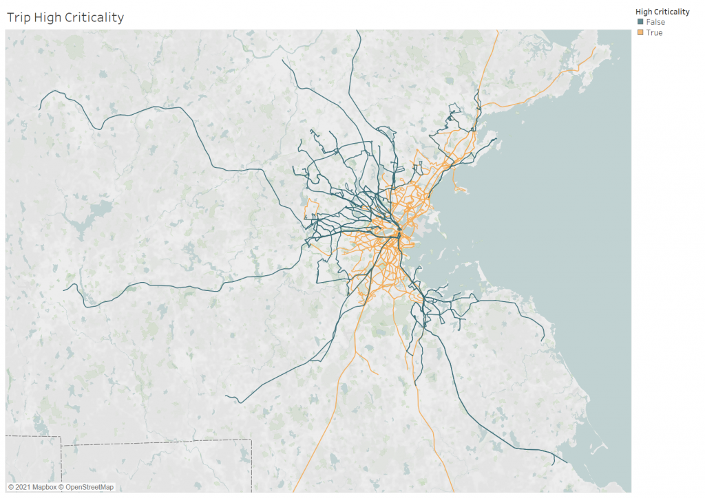
Using a natural break in the data, we established a cut-off point where routes with greater than 98% transit criticality were flagged as “high criticality.” These routes are shown in orange in the map below. As expected based on our existing knowledge of the system, the majority of bus and rapid transit routes were high criticality and most commuter rail services were not. We also assessed commuter rail service at the stop level; if we found that specific stations were high criticality, we could propose the idea of “short turning” the train (if operationally feasible) by having it go out to the high criticality stops and then turning around without completing the full route.

This binary indicator of “high criticality” was used along with a flag for ridership propensity to determine which services in the system would be considered “essential.”
Comparing Results: Residential vs. Trip Transit Criticality
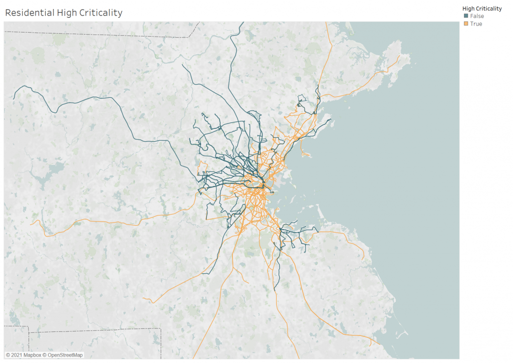
If the same transit criticality cutoff of 98% is applied to the residential metric, you can see that only a few routes show up as “high criticality” because criticality scores are lower across the whole system.

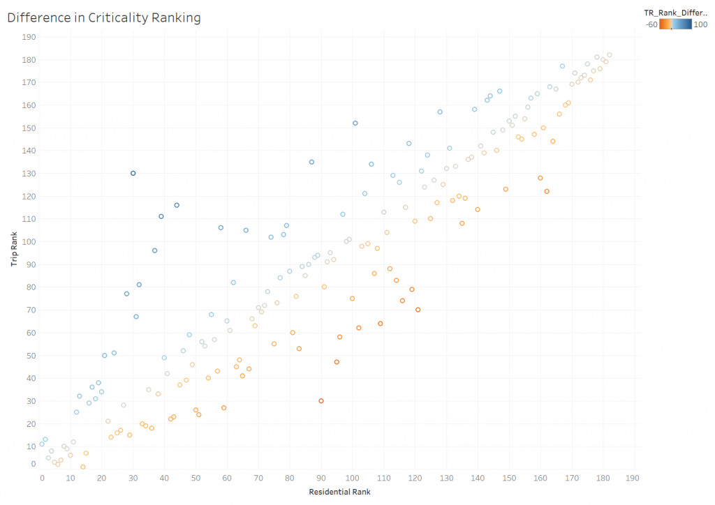
We also compared the two metrics by changing the residential high criticality cutoff so that it produced the same number of high criticality routes as the trip-based version. With this new cutoff, the residential version flagged nine out of the twelve commuter lines as high criticality while the trip-based version only flagged four (Fairmount, Middleborough, Newburyport, and Providence). This difference nicely illustrates a mode-specific problem with the residential metric: the people who live near commuter rail stops tend to be more transit-critical than the people who use commuter rail services. To make decisions based on the residential version would have meant favoring services that are less utilized by transit-critical groups. If you hover over a circle on the scatterplot below, it will show the route it represents and how it was ranked by the residential versus the trip metric. The most transit-critical route is ranked as 182 and the circles are colored according to which metric gave the route a lower ranking (blue for residential, red for trip, grey if the rank is very similar). For example, in the upper left area of the graph, Route 38 stands out in dark blue because the residential metric ranked it at only 30 while the trip-based metric placed it in the top third of highest criticality routes.

The people who live near transit services tend to be less “transit-critical” than the people who travel near transit services, especially during the pandemic. Therefore, a trip-based metric is a better indication of the benefit provided by each service.
Pre-Pandemic Transit Criticality
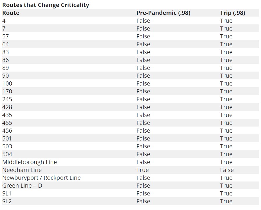
Another advantage of incorporating StreetLight trip data is that we can track changes in trip criticality over time. We recently made a pre-pandemic version of the metric using trip data from July and August of 2019. As expected, overall transit criticality was lower than during the pandemic, and certain routes (using the same 98% cutoff) that showed up as high criticality during the pandemic fell under the cutoff in 2019. Many of these are routes that covered a high proportion of pre-pandemic commuters that began teleworking during the pandemic.

Framework for the Future
As we move out of the pandemic and towards a “new normal,” the MBTA must adjust to shifting transportation patterns, and the metrics we use must adjust as well. We designed this metric during a time of unprecedented change and uncertainty and therefore ensured that it would be flexible to methodological improvements and a variety of use cases.
The “high criticality” cutoff can be adjusted to suit the needs of specific decision-making processes, and we can continuously update the evaluation as new trip demand data becomes available. We were also operating under a significant time constraint when first developing the metric and now have more time to make improvements. Currently, we are working on evaluating origin-destination pairs - giving us a picture of full trips - rather than looking only at origin volumes.
Our goal with the transit criticality metric was to build a tool that measures the actual travel of the groups who most depend on MBTA services and to transform that data into a single meaningful value. Even the best metric is a narrow and flawed representation of reality, but by remaining open to new techniques and data, we can more accurately capture the elements of reality that we most care about.

