The COVID-19 pandemic has greatly impacted transit use, changing trends that were previously well-established and static over time. These circumstances have necessitated a new look at our data to investigate transit changes in a thoughtful way. This post will focus on how we’re thinking about changing ridership trends. Previously, we have analyzed these trends by looking at the number of validations by the time of day, as visualized for each rapid transit line here:
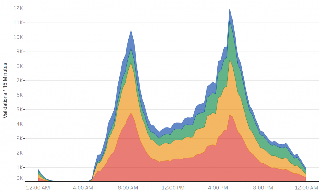
This graph uses data from 2019, and before the pandemic, the trends remained very consistent; if the same graph was shown for 2017, for example, it would be almost identical. Therefore, looking at how daily ridership changed over time was usually not pertinent and averages over a range was sufficient. However, the pandemic has had a remarkable and ongoing impact on ridership, with transit patterns changing based on the current conditions. Looking at ridership throughout the day in this way only tells us how many taps are occurring at each time, not how trends are changing over time because of factors such as workers returning to in-person work. To best understand shifts in ridership over time, we needed to view the data in a different way. First, we sectioned the weekday into eight distinct time periods that are related to the time periods in the Service Delivery Policy, as shown below:

When first analyzing within-day ridership, we looked at the number of taps for each time period over time using this graph:
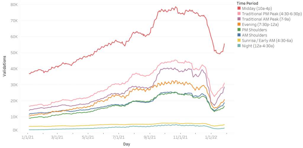
The Midday time period has the most taps, but it is also longest time period as it covers six hours of the day. This graph can be misleading because we want to compare the rates of ridership between time periods, and this is not possible when the time periods are various lengths. To show how busy the T was in each time period, we altered the data to show validations per hour within each one, giving a normalized representation of which time periods have the highest rates of ridership.
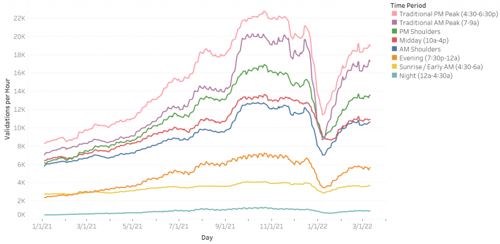
In the updated graph the PM Peak has the highest ridership per hour, with Midday falling significantly below. Each time period has more distinct ridership rates using this method. The updated graph is more accurate to what a rider will experience when using the subway; the PM and AM Peaks are the most crowded, and both have significantly higher ridership per hour than Midday when less people are riding.
Pandemic Impact
Using this new method, we can analyze ridership trends pre- and post-pandemic. Looking at 2019, the AM and PM Peaks have very similar rates, trading off which is the highest throughout the year. Every other time period is very distinct and remains relatively stable, with none overtaking another at any point. This supports what was mentioned earlier; looking at daily ridership trends over time was not necessary pre-pandemic because they remained consistent. The biggest change we can see is near the end-of-year holidays, when many usual commuters and students traveling in the AM and PM peak are on vacation.
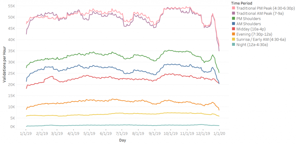
Looking at the trends post-pandemic shows noteworthy results. Ridership rates throughout the day are more similar, especially in the months after the start of the pandemic. This is indicative of lower overall ridership for all time periods, as well as a larger drop for peak ridership in proportion to off-peak. Comparing 2019 and 2021, January AM peak ridership went from approximately 45,000 taps per hour to 7,000, while Midday dropped from approximately 20,000 to 6,500. Interestingly, the PM Peak now has a distinctly higher ridership rate than the AM Peak; AM Peak ridership rate is never above the PM peak at any point. A portion of this phenomenon might be explained by riders having more flexible hours at work post-pandemic, causing workers to go into work at later times and still go home around the end of the traditional workday. It could also be influenced by passengers who are working from home and use the subway only in the evening after their workdays.

Implications for the Future
Ridership was greatly impacted by the pandemic and is still in flux, as seen by the response to Omicron depicted in the previous graphs. Adapting to these changes and thinking of the most accurate way to measure transit activity is important to OPMI, and we will continue to make improvements in how we visualize data. When ridership is at more similar rates throughout the day, like we have seen since the start of the pandemic, there is less overcrowding at peaks and more people will need reliable service during off peak times. Overall, we want to prioritize service to demand, so looking at data like this is helpful in providing the best service possible as we look towards the future.

